Histogram
A histogram is a graph grouping data into intervals, and drawing a bar for each interval, shows the empirical distribution
- It’s a discrete distribution, where events are intervals but not values
For example, the frequency histogram of data 50, 51, 53, 55, 56, 60, 65, 65, 68 with binwidth = 5.
Elements
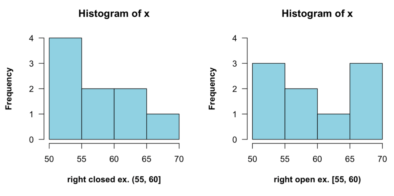
- Boundaries
- Specify the boundaries to eliminate the confusion
- You can choose boundaries to be NON-round numbers, to make sure no data lie on the boundaries
- Bin width ^e0e0f4
- Choose the right bin width to better present the data
- thin width will provide more details, but may not be necessary and give gaps
- thin bins are useful for looking for gaps and heaping
- wide width will wipe out much information
- thin width will provide more details, but may not be necessary and give gaps
- Changing the bin width can help discover the rounding pattern
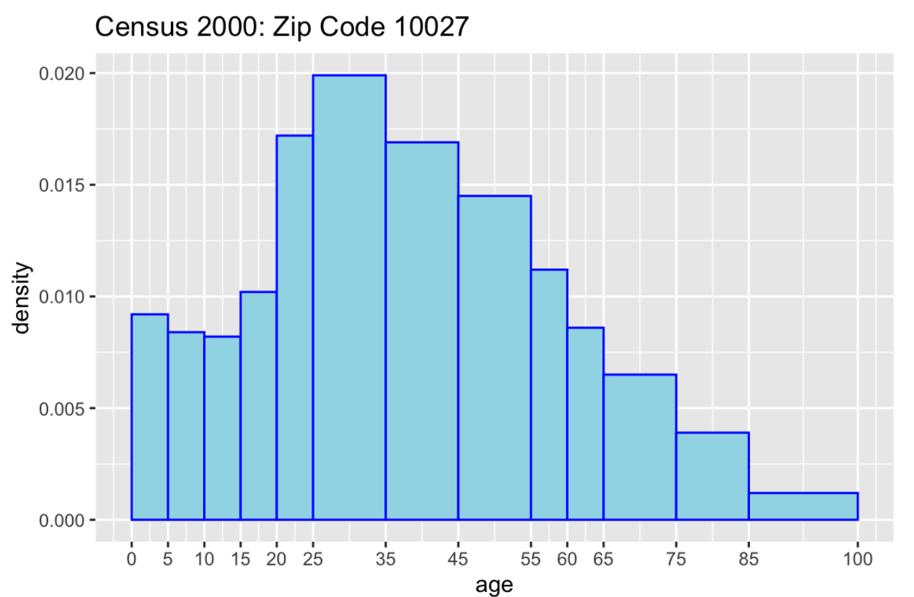
- Uneven bin widths
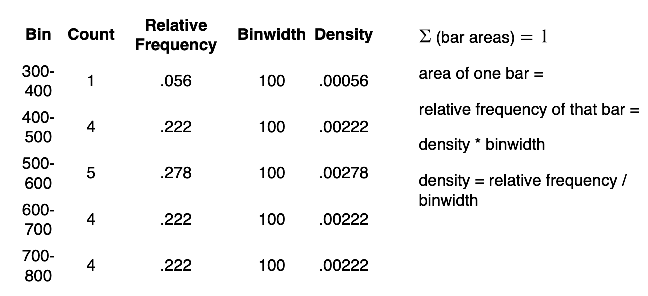
- When using uneven bin widths, use a density histogram ^904jrz
- When using uneven bin widths, use a density histogram ^904jrz
- Choose the right bin width to better present the data
Types
In a histogram, the x-axis is the Continuous Variable to be inspected. And Different y-scales give types of histograms.
- Frequency histogram
- Density histogram
- In a density histogram, the area of a bar equals the relative frequency; thus the y-scale is the density:
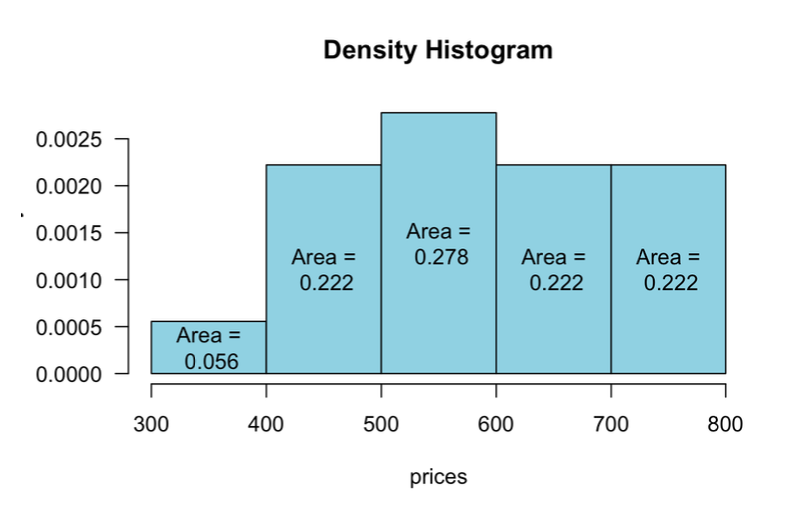
- In ggplot2, use
y = ..density..to specify this scale - It is also very useful to overlay a Density Curve (
geom_density())
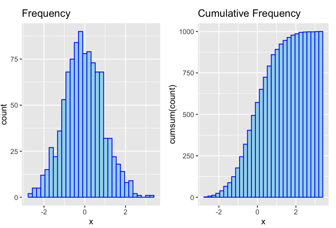
- Cumulative frequency histogram
- is suitable when some frequencies are small to present