ggplot2
The grammar of graphics is the grammar to build graphics with intuitive language.
ggplot2 is an implementation of the grammar of graphics.
ggplot2 enables you to compose graphs by combining different components. Specifically, you
- Add data using
ggplot() - Add layers using
layer()orgeom_* - Adjust the graph using
coordinate_*, etc
Summarized in a template: 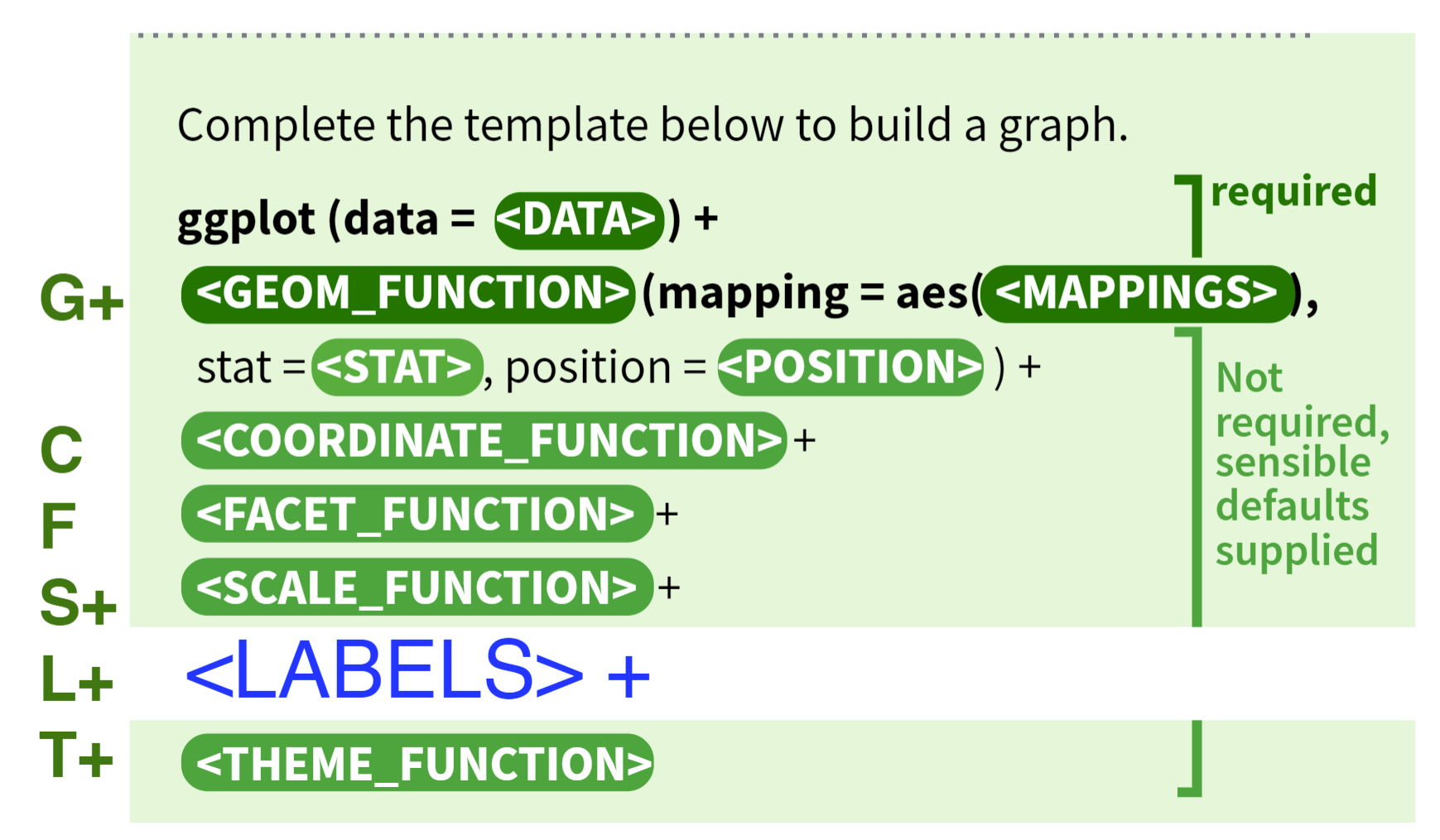
ggplot(data = <DATA>) +
  <GEOM_FUNCTION>(
     mapping = aes(<MAPPINGS>),
     stat = <STAT>,
     position = <POSITION>
  ) +
  <COORDINATE_FUNCTION> +
  <FACET_FUNCTION> +
  <SCALE_FUNCTIONS> +
  <LABEL_FUNCTIONS> +
  <THEME_FUNCTION>
An example:
library("ggplot2")
g <- ggplot(data = iris) +  # Data part
  geom_point(aes(Petal.Length, Petal.Width)) +  # layer 1 with mapping
  geom_point(aes(Sepal.Length, Sepal.Width), color="red")  # layer 2 with a different mapping
plot(g)
This template is the grammar of graphics.
Let’s look into a layer
Layer
A layer is a combination of data, stat, and geom with a potential position adjustment. Usually, layers are created using geom_* or stat_* calls but it can also be created directly using this function.
layer(
  geom = "point",               # geometric object
  stat = "identity",            # statistical transformation
  data = mpg,
  mapping = aes(displ, hwy),    # aesthetic mapping
  position = "identity",        # position adjustment
  params = list(na.rm = FALSE), # additional parameters
  inherit.aes = TRUE,
  check.aes = TRUE,
  check.param = TRUE,
  show.legend = NA,
  key_glyph = NULL,
  layer_class = Layer
)
Function geom_*(...) is a shortcut for layer(geom="*", ...).
Here are some examples for each component
- Aesthetic Mapping
shapelinetypesizefillcoloralphagroup
- Geom
- point
- bar
- boxplot
- line
- histogram
- density
- hex
- Statistical Transformation
- identity
- bin
- boxplot
- density
- Position Adjustment ^569ce1
- identity
stackfillstretch the object to fill the spacedodgeplaces overlapping objects beside one anotherjitteradd noise to objects to separate themgeom_jitter()is shorthand forgeom_point(position = "jitter")
Geom
A geom is the geometric object to represent data, and is the most crucial part of a layer, because different geoms make totally different plots. Thus, People often describe plots by the type of geom that the plot uses. For example, bar charts use bar geoms, line charts use line geoms, boxplots use boxplot geoms, and so on.
By creating multiple layers, you can overlap different geoms in the same graph. In code, just add multiple geom_*() functions.
Aesthetic Mapping
- An aesthetic is a visual property of the objects in your plot
- Different geom has different aesthetic mappings
mappingalways pairs withaes(), whose arguments are aesthetic-value pairsx =andy =can be omitted- To map an aesthetic to a variable, associate the name of the aesthetic to the name of the variable inside
aes() geom_point(mapping = aes(x = displ, y = hwy, color = class))x,ybeing aesthetics highlights a useful insight aboutxandy: the x and y locations of a point are themselves aesthetics, visual properties that you can map to variables to display information about the data- You can also set the aesthetic properties outside the
mapping=aes(), treating them as standalone components; but then the RHS needs to be a specific value rather than a variablegeom_point(mapping = aes(x = displ, y = hwy), color = "blue")
- You can put
mappingin theggplot()function to get global mappings for all layersggplot(data = mpg, mapping = aes(x = displ, y = hwy)) + geom_point() + geom_smooth()- And then the
mappingin a specific can overwrite the globalmappings - Similarly, you can overwrite
datafor a specific layer
Statistical Transformation
Not all graphs plot the same information about the data. Scatter plots plot the raw value, while Histograms plots the frequencies. The algorithm used to calculate the statistics to plot is called a stat, short for statistical transformation.
Like bin, it first puts data in different bins, and then calculates the count in each bin.
stat_*(...) functions are another groups of functions short for layer(stat = "*", ...).
You can generally use geoms and stats interchangeably. Every geom has a default stat; and every stat has a default geom.
To see which stat a geom_* is using by default, use ?geom_*
Position Adjustment
By default, ggplot2 will plot objects “where they are”, i.e., position = "identity". However, this may cause many overlaps that hide information. So there are [[#^569ce1|four other positions]].
Scale
A scale controls how data is mapped to aesthetic attributes, so one scale for one Aesthetic Mapping. Some examples:
| Mapping | Scale (example) |
|---|---|
| x | scale_x_date() |
| y | scale_y_continuous() |
| color | scale_color_manual() |
| fill | scale_fill_viridis_c() |
ggplot(data = iris) +
  geom_histogram(mapping=aes(x=Petal.Length, fill=Species), stat = 'bin',position = 'stack') +
  scale_x_continuous(limits = c(0, 10)) +
  scale_y_continuous(limits = c(0, 50))
Another useful scale for Continuous Variable is the log scale. It can present log-ly related data.
scale_x_log10(breaks = c(1,10,100,1000,10000))
Coordinate
A coordinate controls how the axes and grid lines are drawn. One ggplot can only have one coord.
library(ggplot2)
p <- ggplot(data = iris) +
  geom_histogram(mapping=aes(x=Petal.Length, fill=Species), stat = 'bin',position = 'stack') +
  coord_polar()
plot(p)
The default coordinate is the Cartesian coordinate. Others are
coord_flip()coord_polar()coord_fixed()coord_map()andcoord_quickmap()useful for spatial data
Facet
Faceting can be used to split the data up into subsets of the entire dataset.
ggplot(data = iris) +
  geom_histogram(mapping=aes(x=Petal.Length), stat = 'bin') +
  facet_wrap(iris$Species)
The output graph will be three, one for each species.
To create two-dimensional facets:
- Use option
nrow=xinfacet_wrap() - Use
facet_grid()with R Type - Formula—x ~ y; thenxwill be mapped to rows andyto columns ^b6alii- Use
facet_grid(. ~ x)andfacet_grid(x ~ .)when you only want facet on one variable
- Use
To use different adaptive scales for each facet, use option scales = "free", scales = "free_y", or scales = "free_x".
- When comparing different facets, do not free the scales; use a consistent scale instead.
Labels
ggtitle()xlab(),ylab(),labs()annotate()