Scatterplot
A scatter plot uses Cartesian coordinates to display values for typically two variables for a set of data. The data are displayed as a collection of points, each having the value of two variables determining the position.
The major role of scatterplots lies in revealing associations (EDAV - Dependency Relationship) between variables, not just linear associations, but any kind of association.
Features
- Causal relationships
- correlation ≠ causation, but we still use the y-axis for what appears to be the dependent variable
- Associations
- describe what you see
- Outliers
- Clusters
- Gaps
- Barriers (boundaries)
- Conditional relationships
- different relationships for different intervals of x
An Example
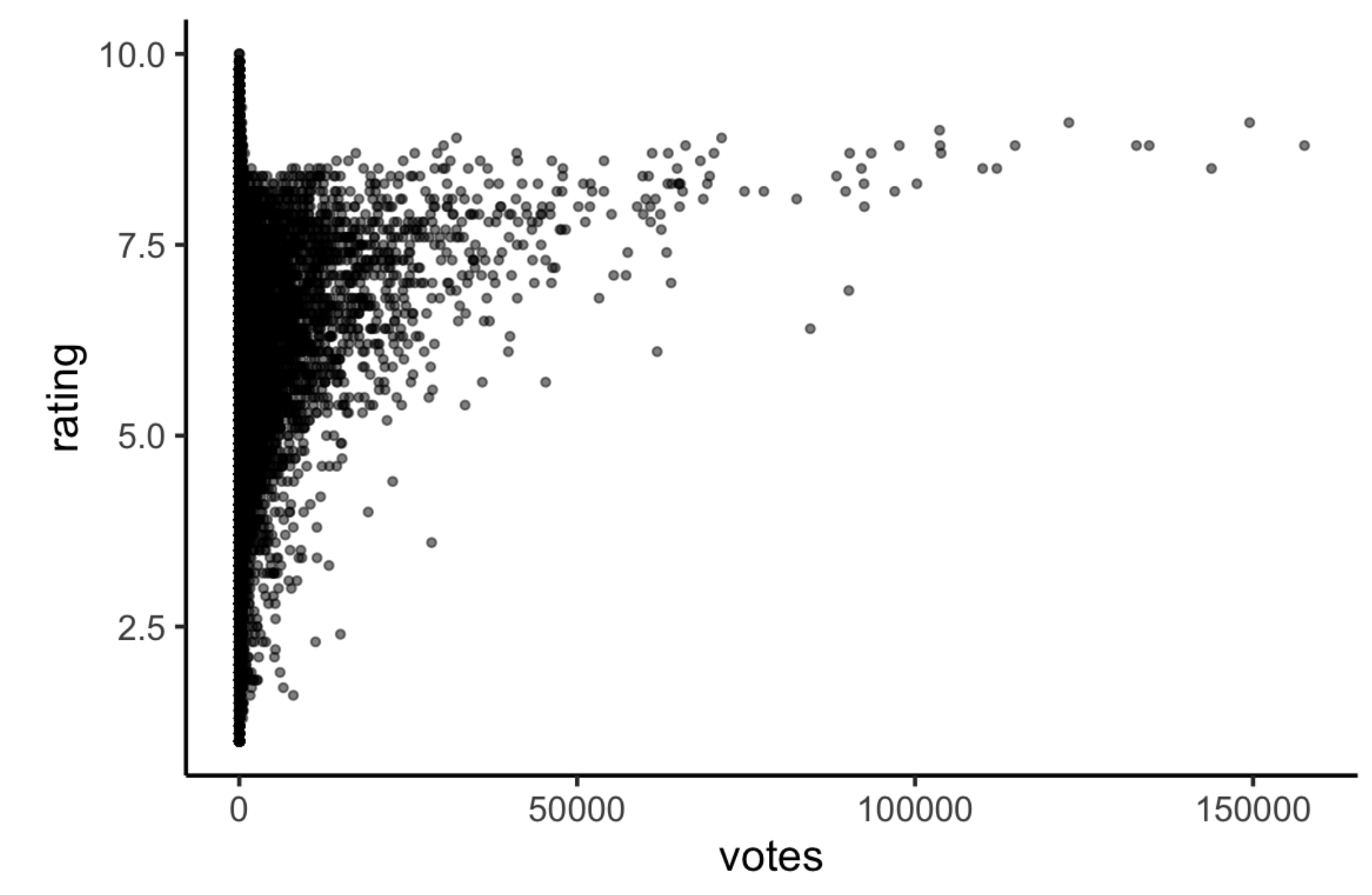
We can observe that
- Boundaries
- No films have high votes and low ratings
- No films have high votes and an average rating close to the maximum possible
- For films with more than a few votes, the average rating increases w/ # of votes
- Outliers: some films appear to have lower-than-expected ratings
- Films with low votes may have any average rating (full range)
- The only films with very high ratings are those with relatively few votes
Overplotting
As we can see in the above example, scatterplots may overplot, making dots stacked together. There are some strategies for this problem
- Change the points in some way
- open circles
- alpha blending
geom_point(alpha = .3, stroke = 0)
- smaller dots
- Default value in
geom_pointissize = 1.5- We can use
ggplot2:::check_subclass("point", "Geom")$default_aesto see the default values in ggplot2
- We can use
- Make
shape = "."
- Default value in
- Don’t plot all points
- randomly sample data
|> slice_sample(n = 1000)
- subset data
- static: by percentiles
- interactive: ggplotly(), plot_ly()
- remove outliers
- randomly sample data
- Transform to log scale
+ scale_x_log10()+ scale_x_log10(breaks = c(1, 10, 100, 1000, 10000))
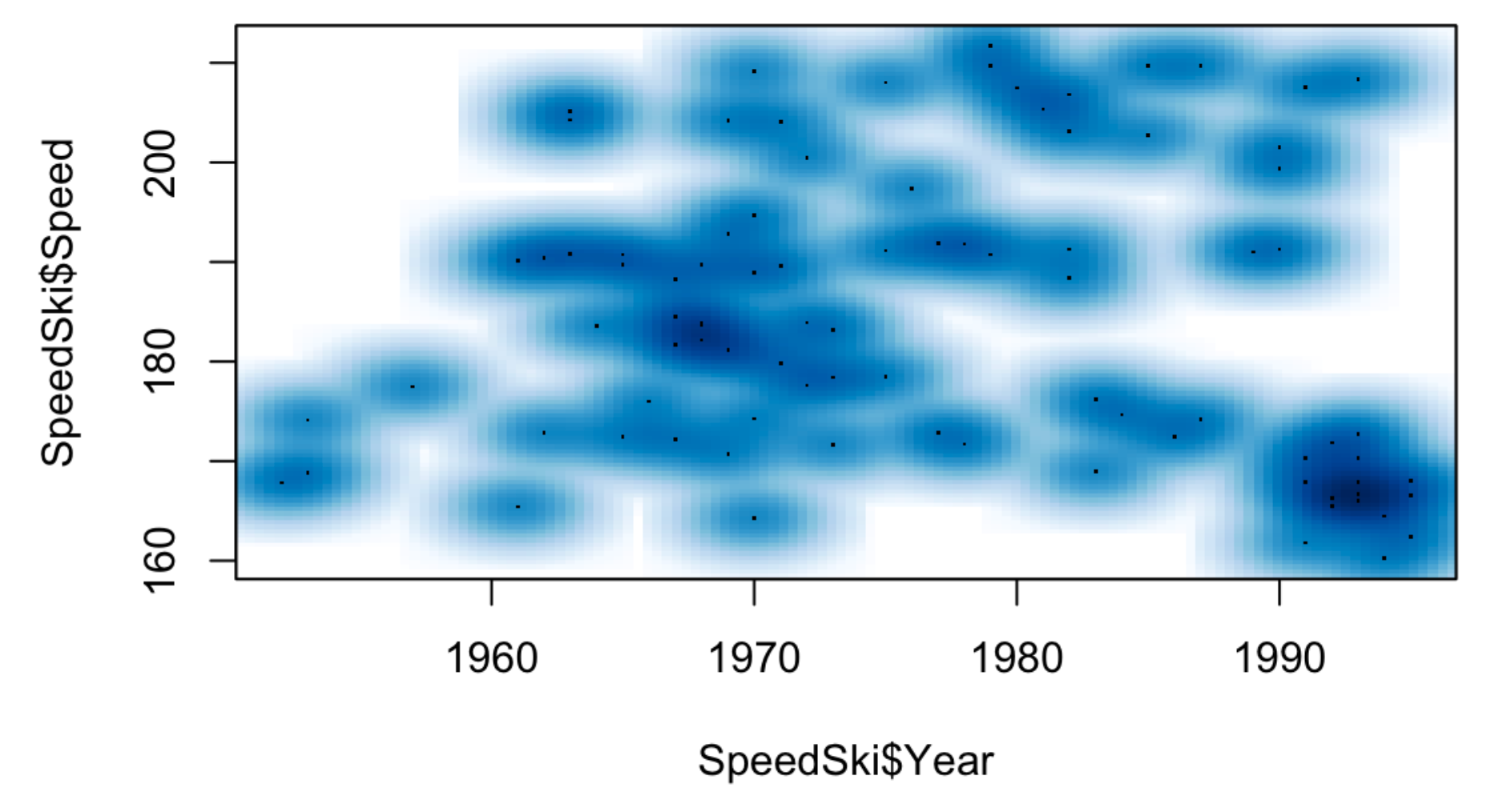
Smooth Scatterplot
A smooth scatterplot is a combination of a scatterplot, a Heatmap, and a Density Contour Plot. It plots the points and uses colors and shapes to show the magnitude of clusters. Use the R built-in function smoothScatter(x,y) to create a smooth scatterplot.